FIS's White Label Loyalty App
I'm not gonna lie to you, this was hard as it took me out of my confort zone because the projects needs were focused on UI design and I'm not as fast with visuals as I'd like to be but it was a great experience and I was able to learn a lot while developing my UI design skills and meet great people along the way.
1. In Medias Res
My role in this project started to play in the middle of the process, the product had already been defined and the requirements established as well as the backend services had already been developed, so, for me, the challenge became the overcoming of my UI and Visual design limitations as my main assignment focused on improving the experience through a visual re-design of the application before its final stage of development and launch. Luckily, I was also enabled to suggest improvements and work on designing them.
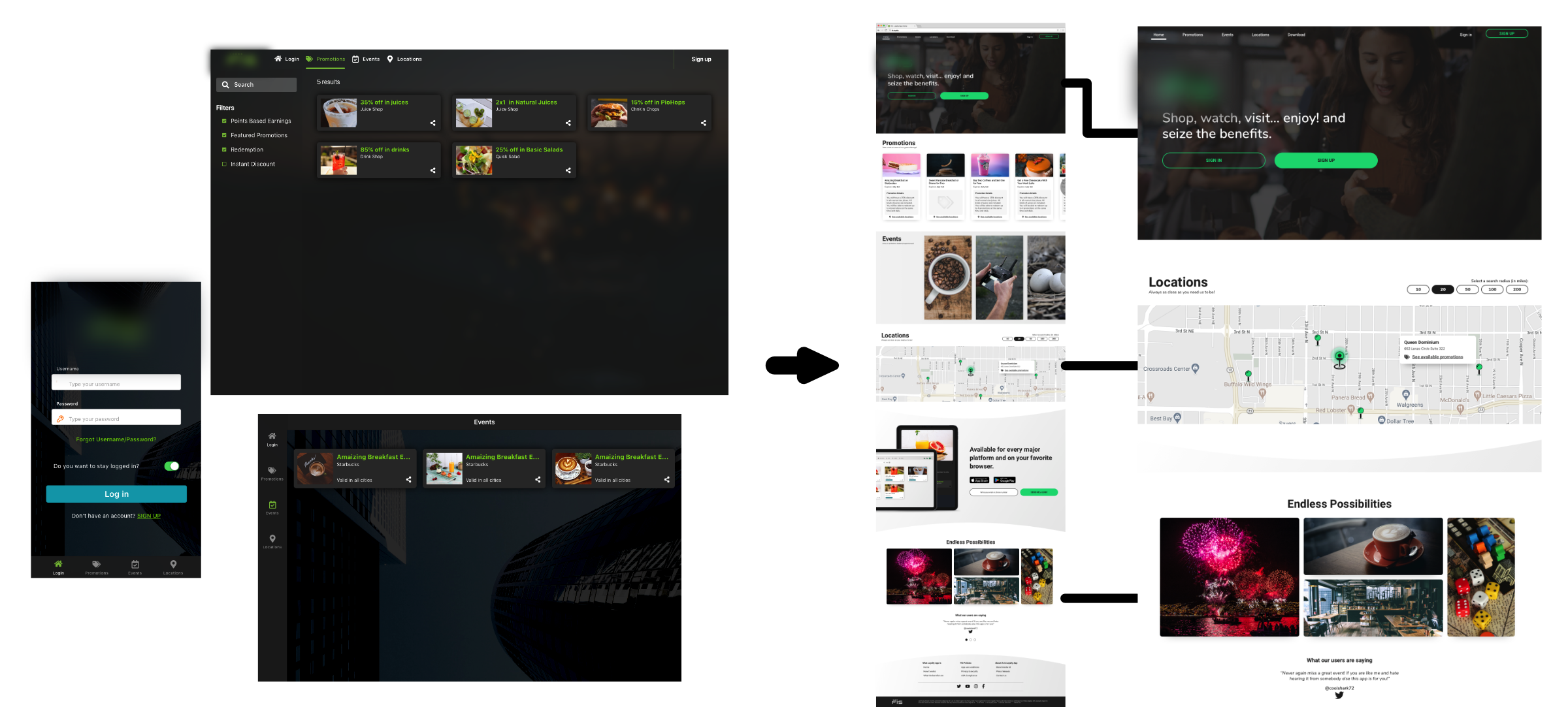
1.1. Home for Unregistered Users
My first contribution to the project was to review the current way in which the application was introduced to the end-users. The original approach was to give them limited access to the main functions without much explanation or guidance. Thinking of the confusion this interaction could produce, and taking into account that one of the main goals of the business was to have users register so that they could get a customized experience, in the long run, I suggested changing the limited application approach for a simple landing page that could introduce the app and educate our user base while also showing some of the benefits by allowing them to take some advantage of the open promotions, giving them a small taste of what was waiting ahead. The changes brought clarity by differencing the types of content, improvements in the information hierarchy, and focus on the main actions the business wanted the user to take.
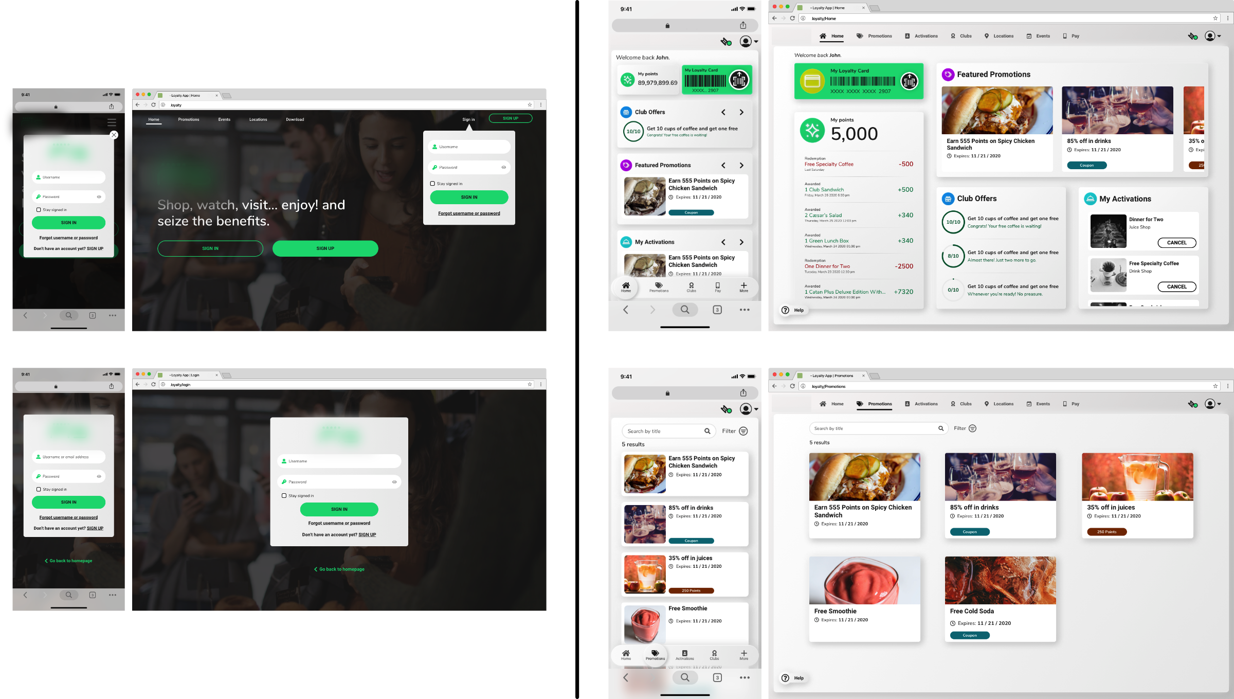
2. The Progressive Web Application
The main idea behind re-bumping the app design was to develop another versatile touchpoint for our user to interact with the platform and so I was assigned the challenging task of designing the UI and visual aesthetics from the ground up.
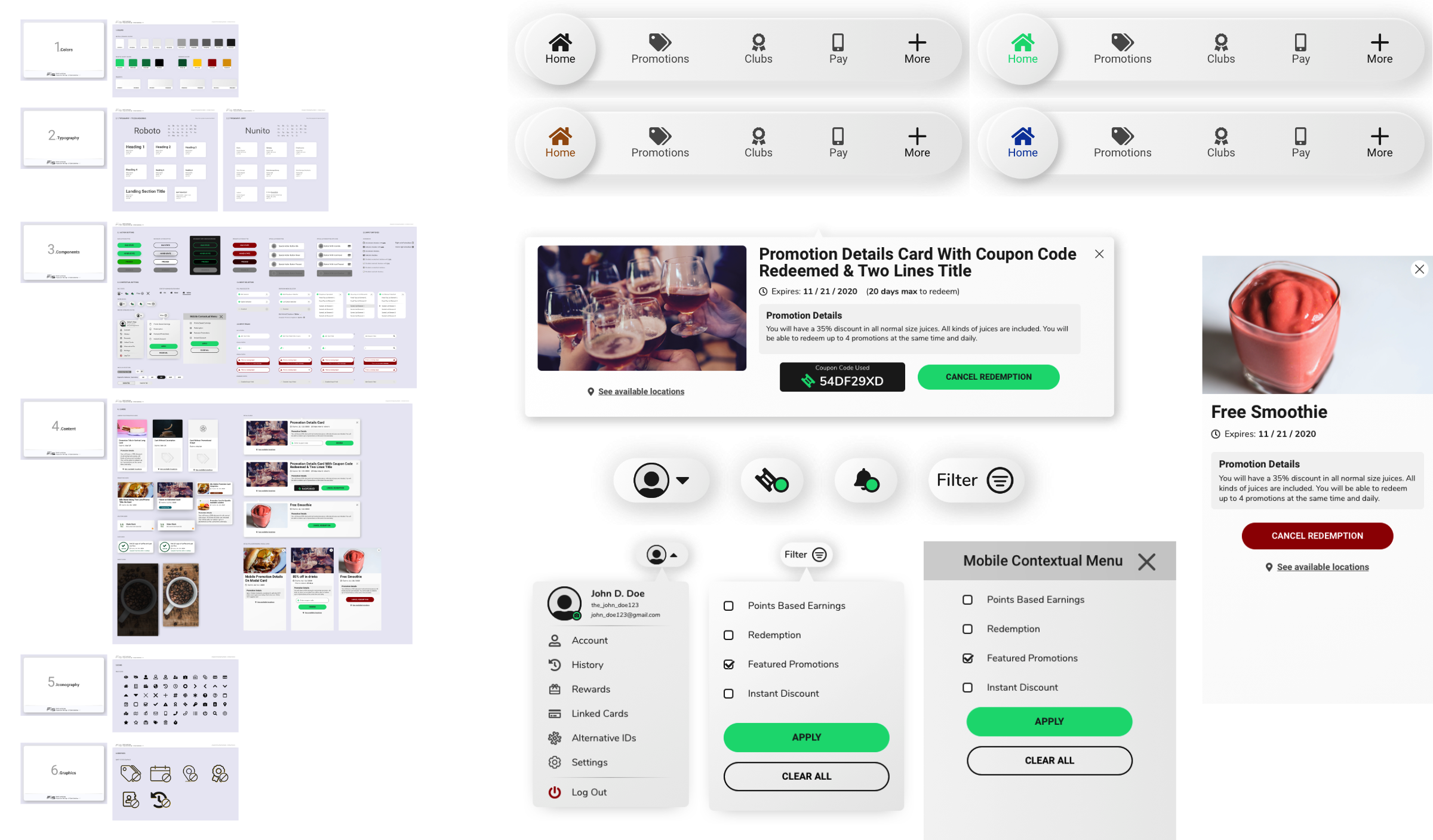
3. The White-Label Challenge
The main visual and UI design challenge was the fact that the app needed to be customizable for different retailers so that these would be able to apply their branding colors. This was a challenge because we needed to ensure at least a minimum of visual accessibility guidelines compliance which made it unsuitable to allow small retailers to tweak every color. We decided the best approach was to make everything as clean as possible and only apply color where it had semantic relevance finally allowing the retailers to only apply their colors as accent ones, giving us some control of how it was going to be used and plan accordingly.
Acknowledgments
Project business analyst: Nicolas Rica.